Source: BBC News
Introduction
The 2020 Election is already underway. With February 3rd quickly approaching, the Democratic candidates have been competing against one-another for the nomination and are preparing to go against President Trump in the general election.
One of the most important factors that determines whether a campaign is successful or not is fundraising. Grassroots fundraising allows the campaign to do what it wants. Buy ads in Iowa? Done. Pay field directors in California? No worries. Some candidates like Michael Bloomberg or Tom Steyer, have been able to fund their own campiagns up to this point, but many candidates do not have that luxury. The candidates who have been able to raise money are the ones still in this race. The question is though, who are these candidates relying on to bring in money? This tutorial will explore what the characteristics are of who is donating to which candidates and perhaps provide some insight on who makes up each of the candidatess bases.
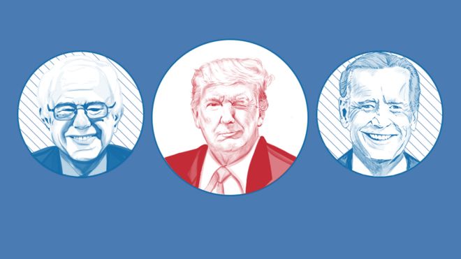
The candidates in this analysis include the President as well as the Democratic candidates who have qualified for the 6th and final Democratic Primary Debate of this year. This includes:
- Former Vice President Joe Biden
- Mayor Pete Buttigieg
- Senator Amy Klobuchar
- Senator Bernie Sanders
- Tom Steyer*
- President Donald Trump
- Senator Elizabeth Warren
* Has no donations recorded by the FEC at the time of this tutorial
Getting Started
The analysis below makes use of Python 3 and the following libraries: pandas, numpy, matplotlib, seaborn, and folium.
# Libraries used for this analysis
#!pip install folium; # installs folium
import pandas as pd # imports pandas
import numpy as np # imports numpy
import matplotlib.pyplot as plt # to plot graphs
from matplotlib.pyplot import figure # to modify size of figures
import matplotlib.patches as mpatches # for
import datetime as dt # for datetime objects
import folium # to create maps
from branca.colormap import LinearColormap # to create color maps
import seaborn as sns # imports seaborn
import warnings
warnings.filterwarnings("ignore")
The Data
The Federal Election Commission (FEC) records all donations made from individuals who have donated more than $200 to any candidate. You can learn more about what the FEC keeps track of with regards to individual donations here.
Here is the dataset of all of the donations from individuals who have contributed more than $200 to any of the main candidates in the 2019-2020 Election Cycle (1.952 million entries). Since the number of entries is too large to download as one file (500,000 entry limit on the FEC website), the data is divided up into 5 different parts and downloaded seperately. Each dataset has the records from a group of states as labeled below:
Then, ten percent of each dataset is randomly sampled to make the data more manageable and to prevent jupyter frrom breaking since too much data would be handled at once and would result in a dead kernel.
# donations from Alabama to California # parse in dates as datatimes
a_c = pd.read_csv('alabama_to_california.csv', parse_dates=['contribution_receipt_date'])
# take a sample of each dataset since total dataset is so large
sample1 = a_c.sample(frac=0.10, random_state=99)
# donations from Colorado to Kentucky
c_k = pd.read_csv('colorado_to_kentucky.csv', parse_dates=['contribution_receipt_date'])
sample2 = c_k.sample(frac=0.10, random_state=99)
# donations from Louisiana to New Hampshire
l_n = pd.read_csv('louisiana_to_newhampshire.csv', parse_dates=['contribution_receipt_date'])
sample3 = l_n.sample(frac=0.10, random_state=99)
# donations from New Jersey to South Dakota
n_s = pd.read_csv('newjersey_to_southdakota.csv', parse_dates=['contribution_receipt_date'])
sample4 = n_s.sample(frac=0.10, random_state=99)
# donations from Tennessee to Wyoming
t_q = pd.read_csv('tennessee_to_wyoming.csv', parse_dates=['contribution_receipt_date'])
sample5 = t_q.sample(frac=0.10, random_state=99)
All 5 of these samples are then joined into one dataset with 162,599 entries that will be used in this analysis. Since this dataset has been created through random sampling, the analysis of this data will still be reflective of the characteristics of the full set of records.
# combine all of the sampled datasets into one
d1 = sample1.append(sample2, ignore_index=True)
d2 = d1.append(sample3, ignore_index=True)
d3 = d2.append(sample4, ignore_index=True)
data = d3.append(sample5, ignore_index=True)
Here is what the first 5 records look like in the sampled data.
# final result, 10% of the total dataset of all donations made in the first 3 Quarters from donors exceeding $200
data.head()
For this analysis, the latitude and longitude of each state and each state’s population will be needed. One dataset that is read in has the locations of each state which can be found here. The other dataset that contains the state’s 2018 populations can be found here. Both datasets are merged together and will be used further down in the analysis.
# dataset to match states with latitude and longitude
states_loc = pd.read_csv('statelatlong.csv')
# dataset with state populations
states_pop = pd.read_csv('State Populations.csv')
# rename column in population data set to make it cleaner for final states dataset
states_pop.rename(columns={'State': 'City'}, inplace=True)
# merge the datasets together into one
states = pd.merge(states_loc, states_pop, on='City', how='inner')
# final states dataset used
states.head()
The list of counties and zip codes in each county will be needed for one of the visualizations used. This dataset can be found here.
# dataset to convert zip codes to counties
counties = pd.read_csv('zip_county_fips_2018_03.csv')
# converts zip column to int values
counties.zip = counties['zip'].astype('int')
# final counties dataset used for analysis
counties.head()
For the last part of the analysis, a classification system is needed to accurately characterize different occupation groups. The Standard Occupation Classification system is used for occupation groupings used in this analysis. More can be learned about the SOC system here.
The first dataset combines different occupations found in the FEC dataset to SOC titles. This dataset can be found here.
# dataset used to classify occupations based on SOC
occupations = pd.read_csv('https://raw.githubusercontent.com/dawaldron/data-visualizations/master/actblue_data_2020/titleocc_xw_final.csv')
# drop unnecessary columns for this analysis
occupations.drop(columns = ['freq', 'source', 'onetcode', 'onettitle'], inplace = True)
# final occupations dataset used
occupations.head()
This second occupation dataset is used to combine these SOC titles into different SOC groupings. This dataset can be found here.
# data set used to group occupations into SOC groupings
occ_agg = pd.read_csv('https://raw.githubusercontent.com/dawaldron/data-visualizations/master/actblue_data_2020/occgrpnm.csv')
# Only need the first two numbers of the SOC number to match subclasses of occupations
occ_agg['occgrpcd'] = occ_agg['occgrpcd'].str[:2]
# final occupational grouping dataset used
occ_agg.head()
Modifying the Data
The FEC data has 79 different columns. For this analysis, only a few columns are needed. Some of these include the ID of the committee that received the donation, the quarter the donation was made in, the name of the contributor, the state the contributor lives in, etc. These columns are taken from the FEC dataset and put in data_clean. Other needed actions on this dataset for this analysis includes converting certain columns to numeric values and only using the first 5 digits to represent the contributor’s zip code. All entries with negative donations (meaning the donation was given back) or donations that exceeded the $2800 FEC limit are dropped for this analysis.
# take the needed columns from the original data that we need for this analysis
data_clean = data[['committee_id', 'report_type', 'contributor_name',
'contributor_state', 'contributor_zip', 'contributor_occupation', 'contribution_receipt_date',
'contribution_receipt_amount', 'contributor_aggregate_ytd']]
# convert some columns to numerical values
data_clean['contribution_receipt_amount'] = pd.to_numeric(data_clean['contribution_receipt_amount'])
data_clean['contributor_aggregate_ytd'] = pd.to_numeric(data_clean['contributor_aggregate_ytd'])
# clean zip code data to only having the 6 digits associated with each zip code
data_clean['contributor_zip'] = data_clean['contributor_zip'].astype(str).str[:5]
# drop any donations that exceeded the limit as well as drop an recended donations
data_clean = data_clean.drop(data_clean[(data_clean['contribution_receipt_amount'] <= 0) &
(data_clean['contribution_receipt_amount'] > 2800)].index)
The name of the candidate each donation was given to can be determined by the committee ID. The recipient’s name is added to the dataset and committee ID is then dropped since it is no longer needed. The Party of the candidate that the donation was given to is also added simply by looking at whether the donation was given to President Trump or not.
# to create recipient name column
names = []
for index, row in data_clean.iterrows():
if row['committee_id'] == 'C00696948': # Sander's Presidential Committee
names.append('Sanders')
elif row['committee_id'] == 'C00580100': # Trump's Presidential Committee
names.append('Trump')
elif row['committee_id'] == 'C00703975': # Biden's Presidential Committee
names.append('Biden')
elif row['committee_id'] == 'C00693234': # Warren's Presidential Committee
names.append('Warren')
elif row['committee_id'] == 'C00697441': # Buttigieg's Presidential Committee
names.append('Buttigieg')
elif row['committee_id'] == 'C00696419': # Klobuchar's Presidential Committee
names.append('Klobuchar')
else:
print('error')
# insert new column into the data_clean dataset
data_clean.insert(0, "recipient_name", names, True)
# drop committee_id column since we now have recipient name
data_clean.drop(columns = 'committee_id', inplace = True)
# Add new column to represent party id, True: Rep, False: Dem
data_clean['Party'] = data_clean['recipient_name'] == 'Trump'
Here is the final cleaned dataset used for this analysis.
# final dataset used in analysis
data_clean.head()
Data Analysis
Percentage of Donations per Quarter
First, let's look at when many of these donations were made. Below is the code used to graph the percentages of donations given during each quarter. The first quarter goes from January to the end of March. The second quarter goes from April to June. The third quarter goes from July to September and the fourth quarter has the remaining months, October, November, and December. From the making of this tutorial, donations recorded by the FEC span from Jan. 1st, 2019 up to the end of the third quarter, Sept. 30th, 2019. At the end of this year, the fourth quarter can be added to this analysis and we can see what new trends, if any, are seen with these added donations.
Below is a function I created that takes in the given data, calculates the necessary values for the bar plot, and then plots the bar plot using matplotlib.
# function that creates a bar plot given a dataset, the column being meausured, the plot, and color of the bars
def bar_plot_func(data, column, p, color):
# calculate total number of donations in given dataset
total_donations = data.shape[0]
# to make the plot bigger
figure(num=None, figsize=(20, 10), dpi=80, facecolor='w', edgecolor='k')
# calculate the number of donations in each of the column's values. In this case either Quarters or Candidates
donos = pd.DataFrame(data[column].value_counts()).sort_index()
# calculate percentages of total donations
donos['% of Total Donations'] = (donos[column].astype(float) / total_donations) * 100
# create bar plot
p.bar(donos.index, donos['% of Total Donations'], align='center', alpha=0.5,
color= color)
# show the percentages on the bar plot
for i, v in enumerate(donos['% of Total Donations']):
p.text(i - .07, v + 1, "{0:.2f}".format(v) + "%", color='black', fontweight='bold')
return p
# produce bar plot for percentage of donations per quarter
quater_graph = bar_plot_func(data_clean, 'report_type', plt, ['tab:red', 'tab:green', 'tab:cyan'])
# to change the labels, add grid, background color, title
plt.xlabel('Quarter')
plt.ylabel('Percentage of Donations')
plt.title('Percentage of Donations per Quarter', fontsize=16, fontweight='bold')
ax = plt.gca()
ax.set_facecolor('ghostwhite')
plt.axes().yaxis.grid()
plt.show()

As you can see, the percentage of donations increased from quarter to quarter which is to be expected as we get closer and closer to the primary elections in February of 2020. Nearly 60% of all donations in the first three quarters were made during the third quarter.
Percentage of Donations per Day
Now lets looks at the percentage of donations made during each day. Since we will be looking at the percentages of donations made for each candidate on each day as well, I made a function that calculates the percentage of donations made for each day based on the givevn dataset. This way we can extract the necessary values needed for the scatter plot.
# function that creates a scatter plot based on dataset, plot, figure, and color
def count_func(data, p, figure, color):
# calculates total donations in dataset
total_donations = data.shape[0]
# determines the size of the plot
figure
# counts the number of donations recieved on that date
count = pd.DataFrame(data['contribution_receipt_date'].value_counts()).sort_index()
# creates new column to store dates as integers from 0 to 280
count['Date'] = count.index.map(dt.datetime.toordinal) - 737060
# x-value is between 0 and 280
x = count['Date']
# y-value is the percentage of donations recieved on that day
y = (count['contribution_receipt_date'] / total_donations) * 100
# to create curved fitted line for the data
poly = np.polyfit(x, y, 2)
f = np.poly1d(poly)
x_new = np.linspace(x[0], x[-1], 50)
y_new = f(x_new)
# add scatter plot to the given plot
p.scatter(x, y, c = color)
# add fitted line to given plot
p.plot(x_new, y_new, c = 'tab:orange')
# to match x index with the appropriate month
index = [0, 31, 59, 90, 120, 151, 181, 212, 243, 273]
months = ['Jan', 'Feb', 'Mar', 'Apr', 'May', 'Jun', 'Jul', 'Aug', 'Sep', 'Oct']
# to add labels, background color, x, y limits, grid
p.set_xticks(index)
p.set_xticklabels(months)
p.set_xlabel('Time')
p.set_ylabel('Percentage of Donations')
p.set_xlim([-10, 280])
p.set_ylim(bottom=0)
p.set_facecolor('ghostwhite')
p.grid()
return p
Added to the scatter plot are lines that mark when each quarter ends as well as a fitted line to better visualize the trend.
# to create a subplot to show the plot
fig, ax = plt.subplots(1, 1)
# to make the plot bigger
fig.set_figheight(10)
fig.set_figwidth(20)
# adds lines marking where the Quarters end
plt.axvline(x=90, linestyle = '-', color = 'tab:red')
plt.axvline(x=181, linestyle = '-', color = 'tab:green')
plt.axvline(x=273, linestyle = '-', color = 'tab:cyan')
# call to function to produce scatter plot
count_func(data_clean, ax, fig, 'tab:blue')
# add appropriate title
ax.set_title('Percentage of Donations over Time', fontsize=16, fontweight='bold')
# add patches used for the legend of the graph
Q1 = mpatches.Patch(color='tab:red', label='End of Q1')
Q2 = mpatches.Patch(color='tab:green', label='End of Q2')
Q3 = mpatches.Patch(color='tab:cyan', label='End of Q3')
# add the legend to the graph
plt.legend(handles=[Q1, Q2, Q3])
fig.show()

As seen with the bar plots and this scatter plot, the percentage of donations in each quarter increased. It was consistent that before the end of each quarter, there was a spike in donations. This is most likely due to campaigns requesting more donations before FEC deadlines. Other explainations for some of the other outliers in donations include days in which there was a Democratic Primary Debate. Some of these dates include June 26-27th, July 30-31st, and Sept. 13th which all saw a spike in donations.
Looking at the Candidates
In this section, the percentage of donations made to each candidate will be analyzed. I used the same functions coded above in the donations analysis for this section as well. Below shows the distribution of both donations and donors in the first three quarters to each of the candidates.
# creates two subplots
fig, ax = plt.subplots(1, 2)
# makes entire figure larger
fig.set_figheight(10)
fig.set_figwidth(20)
# the two different titles for the two graphs
title = ['% of Donations for Each Candidate', '% of Total Donors for Each Candidate']
# the colors used to represent each candidate
color = ['black', 'tab:purple', 'tab:cyan', 'tab:blue', 'tab:red', 'tab:green']
# add grid, labels, subtitles, background color
for i in range(len(ax)):
ax[i].grid(axis = 'y')
ax[i].set_xlabel('Candidate')
ax[i].set_ylabel('Percentage of Total Donations')
ax[i].set_title(title[i],fontsize=16, fontweight='bold')
ax[i].set_facecolor('ghostwhite')
# adds first bar plot to the first subplot
bar_plot_func(data_clean, 'recipient_name', ax[0], color)
# create a dataset that has the number of donors
donors = data_clean.drop_duplicates(subset=['contributor_name', 'recipient_name'])
donors.head()
# adds second bar plot to the second subplot
bar_plot_func(donors, 'recipient_name', ax[1], color)
fig.show()

Since the Democratic donor base is dispersed to more than a dozen different candidates, it is to no surprise that President Trump had the highest percentage of donations and donors.
What was surprising was that more than a quarter of donations made to these top candidates, were made to Senator Bernie Sanders. Senator Sanders has become the fastest candidate in history to reach 1 million donors and is quickly approaching nearly 5 million individual donations. The senator is sitting comfortably with the most money raised and most cash-on-hand out of all of the Democratic Candidates and will moost likely maintain this lead in funding throughout this race.
Senator Warren is in second among the Democratic candidates with about 14% of the donations and donors. Her campaign was able to raise a sizable amount of money during the third quarter with her rise in the polls, but with her recent dip back to third place nationally, it will be interesting to see how much she was able to raise in this fourth quarter.
What is most concerning from this distribution however, is the share of donations and donors the leading Democrat has. Former Vice President Joe Biden has been able to maintain his lead over other Democratic candidates over the past few months, but has had a poor performance in grassroots funding. We will see how well he is able to campaign when money starts to get tight as we get closer to Iowa.
Donations to Each Candidate per Day
Next, lets look at the distribution of donations made to each candidate over time.
# creates a figure with 3 by 2 subplots, one plot for each candidate
fig, ax = plt.subplots(3, 2)
# make the figure larger
fig.set_figheight(20)
fig.set_figwidth(20)
# the different colors for the scatter points in each graph
color = ['black', 'tab:purple', 'orange', 'tab:blue', 'tab:red', 'tab:green']
# the names for each of candidates represented in each subplot
name = ['Biden', 'Buttigieg', 'Klobuchar', 'Sanders', 'Trump', 'Warren']
# adds title and scatter plots to each subplot
w = 0
for i in range(len(ax)):
for j in range(len(ax[i])):
ax[i, j].set_title(name[w], fontsize=14, fontweight='bold')
count_func(data_clean[data_clean['recipient_name'] == name[w]], ax[i, j], fig, color[w])
w += 1
# addes main title to the main figure
fig.suptitle('Percentage of Donations Over Time For Each Candidate', fontsize=16, fontweight='bold')
fig.show()

From this analysis, it is clear that each candidate is following around the same trend seen for the broader set of donations, with each candidate recieving more donations over time.
Some candidates stick out like Biden, who had his highest percentage of donations (close to 5%) come days after he announced his candidacy, while others like Buttigieg, Klobuchar, Sanders, and Warren have steadily increased their donation percentages and recieved their highest percentage of donations on the last day of the third quarter.
Donors in States for Each Candidate
Now lets look at where these donations are coming from. This analysis makes use of a choropleth map. This is a great visual used to show the dispersion of a particular data value across a geographical area. If you wish to learn more about choropleth maps, you can read this article here.
I created a choropleth map of the number of donors in each state per capita for each candidate. This means the number of donors for each candidate is divided by the state's population and shown on the map, the darker the shaded color, the higher the value. I did this analysis per capita since for a state like California, which has a population of nearly 40 million, each candidate has a large percentage of their donors living there just simply becuase there are more people there to begin with. Looking at the per capita dispersion of donors for each candidate shows us which states have a greater support for each candidate and better represents where their donors are concentrated.
The JSON file that is used for this analysis contains the data to represent each state's region and can be found here.
The code below is a function that will be used to create a choropleth map for each candidate. The choropleth method is used to match the states represented in the JSON file with the FEC data. The state's name and the percentage of donors divided by the state's population is extracted from this dataset and used to create the map.
# function that adds a choropleth map to the given map based on given data, color, and name of candidate
def state_map_func(data, m, color, name):
# counts number of donations in each state
donations_state = pd.DataFrame(data['contributor_state'].value_counts()).sort_index()
# adds column of the state each row represents
donations_state['donations_state'] = donations_state.index
# merges this dataset with the states dataset that we read in
donations_state = pd.merge(donations_state, states, left_on = 'donations_state', right_on = 'State', how='inner')
# calculates the donations per capita in each state
donations_state['%'] = ((donations_state['contributor_state'].astype(int) * 10) /
donations_state['2018 Population']) * 100
# used to create folium choropleth map that is added to the given map
folium.Choropleth(
geo_data= 'us-states.json', # json file that shows the regions of each state
name= name, # name of candidate added to the layer control
data=donations_state, # dataset we are pulling from
columns=['donations_state', '%'], # the state and donations per capita in that state
key_on = 'feature.id', # the id value used to match info from json file
fill_color= color, # the color used for the choropleth
fill_opacity=0.7, # changes the filled in color's opacity
line_opacity=0.2, # changes the line's opacity
legend_name='Donors for ' # add title for each legend
+ name + ' Per Capita',
overlay=False, # makes it so that user cannot view two map's at once
show=False # map isn't shown when opened
).add_to(m)
return m
The code below produces a new folium map of the United States that each choropleth map will be added to.
# create new folium map of the United States
s_m = folium.Map(location=[37, -102], zoom_start=4)
# different Folium colors to represent each candidate
folium_colors = ['Greys', 'Purples', 'Oranges', 'Blues', 'Reds', 'Greens']
# adds choropleth map to s_m for each candidate
for i in range(6):
s_m = state_map_func(donors[donors['recipient_name'] == name[i]], s_m, folium_colors[i], name[i])
# adds ability to switch to different maps
folium.LayerControl().add_to(s_m)
s_m
From the map, we learn that many of the candidates have a higher percentage of donors in their home states like Biden in Delaware, Sanders in Vermont, and Klobuchar in Minnesota. It is interesting that candidates like Warren and Sanders share roughly the same states with their high levels of donors.
Perhaps what is the most intersting, however, is how concentrated Buttigieg's donors are since the only area with a relatively high number of donors per capita is in Washington D.C. with a value of 0.45. Every other state only has a value of less than 0.08 including his home state of Inidiana which doesn't even register on the map.
The map for President Trump also show's high percentages of donors in states like Florida, Wyoming, Nevada, and Arizona. Arizona may be an important state in the 2020 election not just in terms of the electoral college, but also in the senate race. We will see what effect Trump having a high number of donors per capita in the state will have on both races.
County Level Analysis on Individual Donors
We have seen which states have relatively high number of donors per capita for each candidate. Now lets see how the candidates stack up against eachother on the county level.
This analysis makes uses of two chorpleth maps, one comparing the donors of each Democratic candidate and the second comparing the donors of each party.
The function below uses the converted dataset to create a choropleth map that shows the color of the candidate or party with the highest percentage of donors in each county. The darker the shade of the region, the higher the percentage of donors for that candidate or party.
To create a custom choropleth map with different color scales, I used the geojson method from folium to visualize the data.
The JSON file used to show the county regions can be found here.
# function that produces choropleth map for all the candidates on the county level
def county_map_func(best, m, map1):
# colors used to represent each candidate
color = ['black', 'purple', 'orange', 'blue', 'red', 'green']
# a list to add all of the color scales to
color_scale = []
for i in range(len(color)):
color_scale.append(LinearColormap(['white', color[i]], vmin = min(best['%']), vmax = max(best['%'])))
# function that gets the right color for the choropleth map given county value from json
def get_color(feature):
# value is the row with the county from feature
value = best.loc[best['county'] == feature['properties']['NAME']]
# if no row for given county, return yellow
if value is None:
return '#e0e028'
# if more than one County row, means it is a tie return white
elif len(value) != 1:
return '#ffffff'
# used for the first county map, determines the color used for choropleth
if map1:
if value['name'].item() == 'Biden': # Biden
return color_scale[0](value['%'].item())
elif value['name'].item() == 'Buttigieg': # Buttigieg
return color_scale[1](value['%'].item())
elif value['name'].item() == 'Klobuchar': # Klobuchar
return color_scale[2](value['%'].item())
elif value['name'].item() == 'Sanders': # Sanders
return color_scale[3](value['%'].item())
elif value['name'].item() == 'Warren': # Warren
return color_scale[5](value['%'].item())
else:
return '#000000'
# for the second map
else:
if value['name'].item() == 'Trump':
if value['%'].item() > 50.00:
return color_scale[4](value['%'].item()) # Trump higher percentage, use his color
else:
return color_scale[3](100 - value['%'].item()) # Dems higher percentage, use blue
else:
return color_scale[3](100) # No Trump, means Dems 100%
# creates folium map
folium.GeoJson(
data = 'cb_2015_us_county_5m.json', # json that has county regions
style_function = lambda feature: { # determines the color to add
'fillColor': get_color(feature), # calls get_color function
'fillOpacity': 0.7, # changes opacity of filled areas
'color' : 'black', # color of lines
'weight' : 0, # lines not to be shown for counties
},
name = 'map', overlay=False).add_to(m)
return m
The function below calculates the percentage of donations for each candidate and keeps the rows of the candidates with the highest percentage in each county.
# function that converts given data to be used for county level maps
def convert_for_map(data):
# counts donors per zip code
donations_county = pd.DataFrame(data.groupby('contributor_zip')['recipient_name'].value_counts()).sort_index()
donations_county.rename(columns={'recipient_name':'freq'}, inplace = True)
donations_county = donations_county.reset_index()
# converts zip column in donations_county to type float
donations_county['contributor_zip'] = donations_county['contributor_zip'].astype('float')
# merges counties with donations_county
donations_county = pd.merge(counties, donations_county, left_on = 'zip', right_on = 'contributor_zip',
how='inner')
# calculates number of donations in each county
sums = pd.DataFrame(donations_county.groupby('countyname')['freq'].sum())
sums = sums.reset_index()
sums.rename(columns= {'freq':'total_county', 'countyname':'county'}, inplace = True)
# calculates number of donations in each county for each candidate
sums_candidates = pd.DataFrame(donations_county.groupby(['countyname', 'recipient_name'])['freq'].sum())
sums_candidates
# addes county and name colomns to dataset
county = []
name = []
for index, row in sums_candidates.iterrows():
county.append(index[0])
name.append(index[1])
sums_candidates['name'] = name
sums_candidates['county'] = county
# combines datasets
sums_both = pd.merge(sums_candidates, sums, on='county', how='inner')
# calculates % of donations in county for each candidate
sums_both['%'] = sums_both['freq'] / sums_both['total_county']
# finds indices with the highest percentage of donations for each county
idx = sums_both.groupby('county')['%'].transform(max) == sums_both['%']
# drops other rows that arent included in idx
best = sums_both[idx]
# takes out County substring for county names in county column
best['county'] = best['county'].map(lambda x: x.replace(' County', ''))
# multiply the % by 100
best['%'] = best['%'] * 100
# take out needed columns for maps
map_dict = pd.DataFrame(best[['county', 'name', '%']].copy())
return map_dict
The first choropleth map will look at the different Democratic Candidates. This requires dropping any rows for Trump in the donors dataset.
Here is the converted dataset that will be used for the first choropleth map.
# Find rows that are for Trump
ind = donors[donors['recipient_name'] == 'Trump'].index
# Drops those rows to only have Dem candidates left
donors_minus_trump = donors.drop(ind)
# Convert dataset to a dataset we can use for map
donors_minus_trump_map = convert_for_map(donors_minus_trump)
# final dataset used for first county level map
donors_minus_trump_map.head()
A new folium map is created of the United States. Missing data is colored pink. Counties with ties are colored white. Each of the candidates are represnted with the following colors:
- Biden - Grey
- Buttigieg - Purple
- Klobuchar - Orange
- Sanders - Blue
- Warren - Green
# Creates new folium map of United States
c_m1 = folium.Map(location=[37, -102], zoom_start=4)
# Adds Choropleth map
map1 = county_map_func(donors_minus_trump_map, c_m1, True)
map1